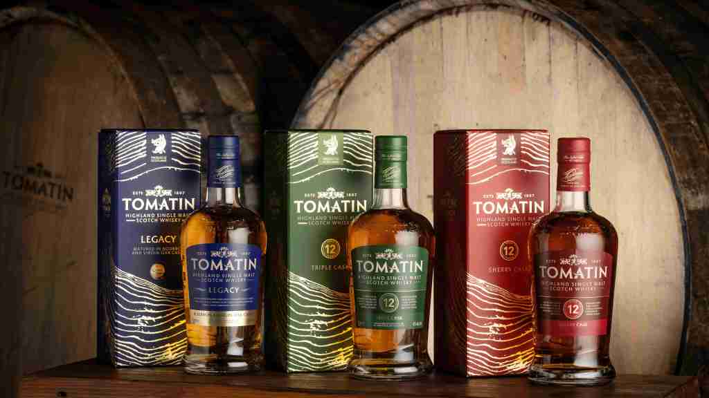
The Tomatin Distillery has unveiled a packaging refresh for its core range of single malts, marking the next chapter in the brand’s visual evolution while remaining true to the values that have defined the Highland-based distillery for more than a century.
The new design highlights the Highland based distillery’s dedication to cask management and introduces new label designs to further enhance visual impact and shelf presence. The brand’s messaging has also been streamlined, with clearer product names and simplified information to better communicate each whisky’s character.
At the heart of the redesign is a premium box adorned with a wood-grain motif, symbolising the natural tree rings found in oak. This reflects the distillery’s commitment to wood and its knowledge of the history of each cask that passes through its warehouses, marking a thoughtful evolution from the previous landscape-led design. Each expression is distinguished by a vibrant colourway, ranging from dark indigo, forest green and scarlet red to rich purple and teal blue.
Commenting on the news, Jennifer Masson, Head of Marketing at Tomatin, said: “This bold new packaging reflects what we do best at Tomatin – exceptional cask management, craftsmanship and attention to detail. It aligns our visual identity with consumer expectations in modern retail and on-trade settings and gives our whiskies greater presence in global markets. Our focus remains unchanged – creating remarkable single malts at excellent value for whisky lovers around the world.”
The Tomatin packaging refresh is being rolled out globally across its Legacy and 12 Year Old Triple Cask releases – the latter being renamed from Tomatin 12 Year Old – with the remainder of the core range following in the coming months.


Leave a comment