
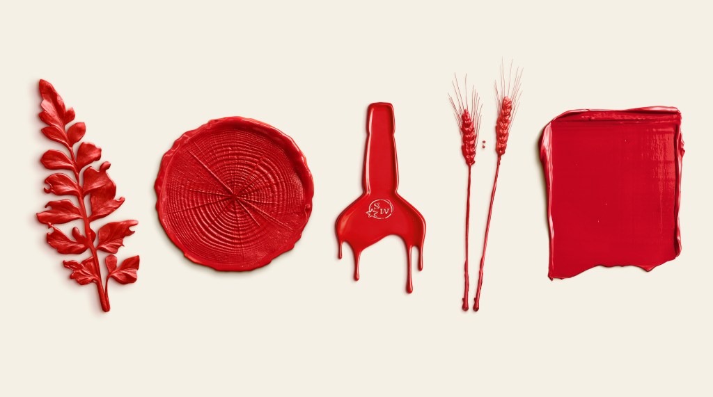
The Kentucky-based Maker’s Mark Distillery, has unveiled a refreshed global brand identity for its Bourbon, featuring an updated colour palette, typography, photography and graphic elements that place its iconic red wax centre stage.
Now reflected on the brand’s website, the new identity is designed to bring to life the extraordinary lengths Maker’s Mark has gone to in making its bourbon since its beginnings. Founders Margie and Bill Samuels Sr. built the brand by doing things differently: burning their 170-year-old family recipe to create a more balanced bourbon; choosing their home in rural Loretto for its water source and proximity to grain growers; and hand-dipping every bottle in its signature red wax. This challenger spirit has served as the inspiration for the new visual identity.
Custom typography inspired by Margie’s handwriting captures her wit and wisdom, while tactile wax marks, created using natural elements found across Star Hill Farm – including wheat stalks, oak rings and native flora – connect the design to the people, land and craftsmanship behind Maker’s Mark. Developed in partnership with London-based creative agency Turner Duckworth, the resulting visual system reimagines the thoughtful, handcrafted sensibility behind the bourbon, bottle and brand in a more contemporary, minimalist way, while remaining unmistakably Maker’s Mark.
Commenting on the news, Rob Samuels, Eighth-Generation Whisky Maker and Managing Director, said: “My grandparents weren’t thinking about ‘branding’ when they created Maker’s Mark. They cared about a handmade process in service of flavour and design that honours that vision. That deeply personal approach created some of the most recognisable symbols in bourbon. This new and exceptional work brings that same intention forward, honouring what they created and ensuring Maker’s Mark feels as personal and distinctive today as it did from the start.”
Chloe Lloyd-Jones, Vice-President of Global Brand Marketing, added: “In a world increasingly driven by speed and automation, we still believe some things are worth making slowly, by hand. We returned to Star Hill Farm, working with natural materials from the land and our signature red wax to create a visual identity that reflects the ‘Perfectly Unreasonable’ spirit behind our bourbon. The result gives us a powerful way to tell our story around the world, while creating experiences that feel personal and relevant in each market.”
Elements of the new identity have already been brought to life through experiences in the United States and China, alongside out-of-home advertising in Australia and the UK. The rollout will continue across markets and channels throughout 2027, giving consumers new ways to experience Maker’s Mark.


Leave a Reply